 (NYSEARCA:UNG)")
Natural gas prices are down about 80% from their highs nine months ago and down 60% from their levels only five months ago. This has likely contributed to sluggishness in natural gas stocks, as evidenced by the performance of the First Trust Natural Gas ETF (FCG) over that same period of time. Unsurprisingly, the collapse in natural gas prices is reflected in the abysmal performance of commodity-tracking ETFs like the United States Natural Gas Fund, LP ETF (NYSEARCA:UNG) and the United States 12 Month Natural Gas Fund, LP ETF (UNL).
Chart A. Natural gas prices and related ETFs have declined significantly the last nine months. (StockCharts.com)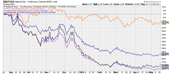
In this article, I am going to argue towards the following conclusions:
- Natural gas prices are likely to see a substantial rise over the next 16-24 months.
- Neither UNG nor UNL are, at present, good instruments to take advantage of such a rise due to the pronounced contango in the natural gas market at the moment.
This is based on an analyses of commodity cycle dynamics within current macro conditions and the history of natural gas prices over the last 60 years.
In a subsequent article, I intend to argue that, although natural gas prices are likely to stabilize if not rise:
- Natural gas equities – particularly in the exploration and production space, such as those represented in FCG – are not likely to significantly benefit from even a doubling of prices.
- Over the longer term, natural gas stocks are likely to outperform the broader equity market and exchange-traded funds, or ETFs, like UNG and UNL, but they are likely to suffer from a period of low absolute returns.
For now, however, let’s begin with the outlook for natural gas prices.
Commodity principles
In December, I wrote “DBE ETF: Energy Prices Likely To Start Leading Market Down.” I argued there that markets, including commodity markets, have likely entered a “secular” period of lower returns and that we are probably in a cyclical downturn within that “secular” bear market. That cyclical downturn might be expected to last at least until 2024 while a more general period of depressed returns could last well into the 2030s. In the meantime, I argued, energy prices were likely to feel the brunt of that cyclical downturn, more so than precious metals, industrial metals, and agricultural commodities. So far, there has not been much reason to change that general outlook on energy, but it appears that natural gas may be somewhat oversold now, and the underlying rationale behind the energy outlook points to an idiosyncratic trajectory for natural gas. In other words, we are likely to see stabilization in natural gas prices before we see it in the rest of the energy complex.
I have described the approach that will be employed here in greater detail in previous articles, including a general piece on commodities in March of last year. For now, however, I will briefly recap some of those elements and how they relate to natural gas prices.
We can divide commodity price behavior into structural, super cyclical, and cyclical tendencies. Structurally, commodity prices collectively tend to be flat over centuries, and individually they tend to follow a simple formula: price = 1/supply, which suggests that price is not driven primarily by supply-demand dynamics.
Rather, real commodity prices have been consistently correlated with the earnings yield on equities for the last 150 years. As the chart illustrates below, this has been less true for natural gas prices (presumably because it is not as fungible as most other primary commodities).
Chart B. Commodity prices have historically tracked the earnings yield, although natural gas prices are less obedient to this rule. (World Bank, St. Louis Fed, Robert Shiller data, S&P Global)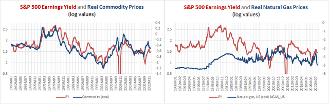
On top of this, decade-long commodity super cycles occur during periods marked by increased global instability (as reflected in global deaths in battle) and periods that are marked by the transition from one dominant technological paradigm to another. This was discussed in greater detail in the series Conjunction & Disruption: Technology, War, And Asset Prices. On the flip side, commodity prices tend to be depressed during periods of rising PEs, increasing global stability, and the diffusion phase of a disruptive innovation (for example, autos and radios, TVs, PCs, smartphones).
And, since the establishment of the Federal Reserve, super cyclical waves in commodity prices (and the phenomena associated with them) have occurred every 30 years (for example, the 1910s, 1940s, 1970s, and 2000s). Apart from a few particulars, this is the modern form of Kondratiev Waves, as discussed in that series.
Finally, commodity prices also have a cyclical mode of behavior. Generally, they rise and fall with corporate earnings and interest rates. They tend to peak every three to five years. They also have what we might call a commodity curve. That is, precious metals rise before industrial metals, which rise before agricultural commodities (most notably grains), which rise before energy prices. Industrial metals are most closely aligned with the earnings cycle, which appears to form the core of the larger market cycle.
Chart C. The nature of commodity and market cycles often helps us to anticipate future performance. (Author)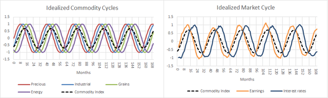
By monitoring super cyclical and cyclical conditions, which are driven by fundamentals outside of the current scope of current economic theory, I suspect that we can anticipate moves in various asset classes, including commodities.
For example, at the cyclical level, the ratio of precious metals prices to those of a given commodity tends to predict the subsequent behavior of that commodity. That is illustrated in the chart below.
Chart D. Because of the nature of the commodity curve, gold ratios help predict cyclical moves in other commodities. (Author)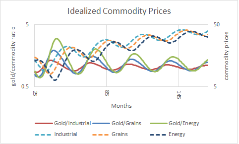
Because of the nature of the commodity curve, a high gold price (gold is the precious metal par excellence) relative to another commodity likely indicates that that commodity will rise over the next 16 months or so. Similarly, a low gold price ratio suggests that commodity will decline over the next 16 months or so.
Gold as a leading indicator
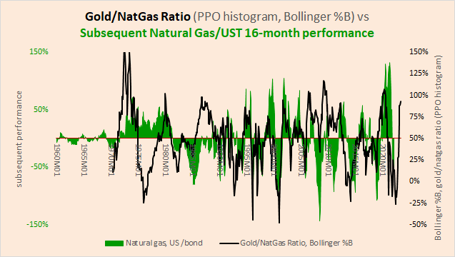
This is illustrated in the following two charts. The first chart compares the gold/natural gas ratio (in red) with the subsequent performance of natural gas prices (in blue). The second chart compares the Bollinger %B technical indicator for the gold/natural gas ratio (in black) alongside the subsequent performance of the ratio of natural gas prices to 10-year Treasury bond returns (in green). Where the %B indicator equals 100%, the gold/natural gas ratio has moved two standard deviations up. Where it is 0%, the ratio has moved two standard deviations down. In recent weeks, the %B indicator has been in excess of 100%.
Chart E. The gold/natural gas ratio often anticipates natural gas cycles. (World Bank) Chart F. Momentum in the gold/natural gas ratio can also predict subsequent natural gas performance. (World Bank, Shiller)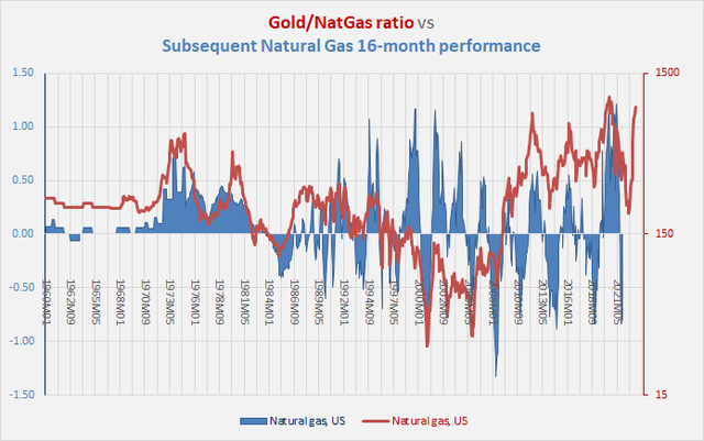
This works better with some classes of commodities (for example, grains) better than other classes (for example, beverages) and within classes, this works better with some commodities (for example, tea) than others (for example, cocoa). Knowing that market cycles tend to last three to five years also helps us create additional ways to measure the status of a given cycle, and knowing that yields are correlated with other elements of the market cycle allows us to amplify the cycle by looking at performances relative to Treasury bonds.
As the current downcycle ages, some commodities are likely to get to the bottom sooner than others. One of those appears to be natural gas. But, natural gas behaves in rather unusual ways.
Natural gas cycles
First, as illustrated in Chart B above, natural gas has not obeyed the dictates of the earnings yield-commodity correlation as well as other commodities have. Second, its cyclicality is somewhat erratic. In the following charts, I contrast the natural gas cycles with the industrial metals cycle, the earnings cycle, and the energy cycle.
Chart G. The natural gas cycle appears to be much more erratic than the industrial metals cycle, but this has stabilized over time. (World Bank) Chart H. Natural gas cycles have increasingly correlated with earnings cycles. (World Bank, Shiller, S&P Global) Chart I. Natural gas is still volatile, but essentially behaves like other energy commodities. (World Bank)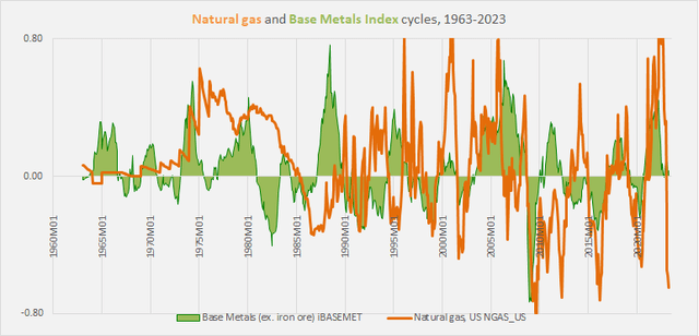
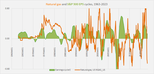
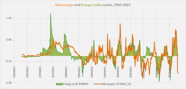
The natural gas cycle has increasingly marched in step with the energy cycle, although it can still experience extreme short-term volatility. The energy index above is calculated using World Bank constant weights, with natural gas’s contribution only coming in at 10%, so this increased correlation is unlikely to be due to the direct impact of natural gas prices.
As with other commodities, the gold ratio has been a generally reliable predictor of subsequent natural gas performance, particularly when the gold/natural gas ratio makes extreme moves. This is shown in the following chart, where we see the gold/natural gas ratio at the top and the histogram of the percentage price oscillator in the middle overlaid with a Bollinger band. The bottom panel of the chart shows natural gas prices to show the connection between extreme moves in the gold/natural gas ratio and natural gas prices themselves.
Chart J. Extreme moves in gold/natural gas ratio can often predict subsequent natural gas cycles. (StockCharts.com)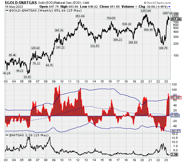
Currently, the extremely high momentum in the gold/natural gas ratio (thanks to both a strong gold performance and exceptional weakness in natural gas) suggests that we are nearing a bottom in natural gas prices. Over the last 60 years, extreme moves in the gold/natural gas ratio have resulted in roughly 75% upside in natural gas over the following 16 months, give or take 75%. That is, in 16 months’ time, a range for natural gas prices somewhere between $2.00 and $5.50 would be normal.
For someone who is extremely overweight a downcycle scenario for markets, this is an attractive proposition, as it potentially allows one to hedge against those deflationary bets. But, as I will try to show, it is difficult to put this thesis into practice.
One reason is that the volatility of natural gas prices makes it less amenable to standard cyclical measures. For example, the best results for beating both the natural gas, using monthly spot data from the World Bank, and 10-year Treasury bond markets over the last sixty years was trading with changes to the fickle 16-month rate of change. Even this was only slightly better than buying and holding Treasuries.
The following chart shows natural gas prices in the top column followed by three measures of estimating 16-month (or 69-week) momentum.
Chart K. Natural gas momentum appears to be bottoming. (StockCharts.com)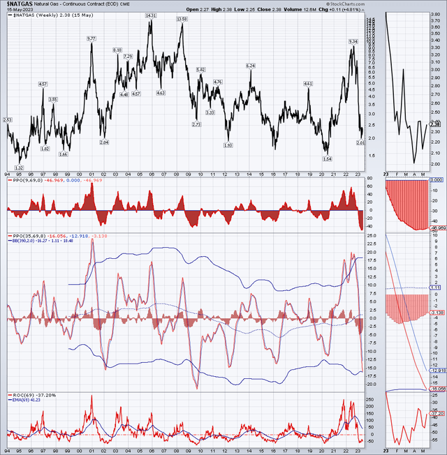
Theoretically, jumping between natural gas and 10-year Treasury bonds with every shift in the 16-month rate of change would allow one to beat a (theoretical) buy-and-hold strategy, and over the last five months, there does seem to be a favorable shift in momentum.
The problem is, even assuming that this method is reliable and that natural gas prices are indeed about to enter a new bull market, how can we express this in the form of a trade or investment? I do not think it is especially practical.
The natural gas futures curve
History suggests that two conditions generally need to hold to increase one’s chances of making money in natural gas ETFs:
- Spot prices need to rise.
- The futures curve needs to be inverted or relatively flat.
But, this is a difficult needle to thread, because the futures curve (generally, the spread between long-dated futures and spot prices) generally moves in the opposite direction as spot prices. In other words, futures curves are most likely to be inverted when spot prices are peaking, and when spot prices are bottoming, the futures curve is most likely to be steep.
I am going to briefly review the relationship between spot prices and futures and then how that plays out at the level of the UNG and UNL ETFs. The futures curve analysis will rely on monthly data provided by the US Energy Information Administration on spot and futures prices for the subsequent four months’ contracts since the mid-1990s. That history is illustrated below.
Chart L. The whole of the curve tends to stick fairly close together over the long run. (US Energy Information Administration)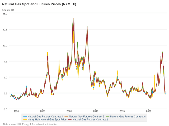
Generally, futures shadow spot prices pretty closely.
The following chart shows futures curves calculated in three ways, the log of the ratio between the fourth delivery month’s futures price (i.e., “Contract 4”) and the spot price, the log of the ratio the fourth and first delivery month’s futures prices (i.e., “Contract 4” and “Contract 1”), and the slope of the log of all prices from spot through to Contract 4 prices.
Chart M. Contango is the normal state of the futures market, but this is punctuated by brief but sharp episodes of backwardation. (US EIA)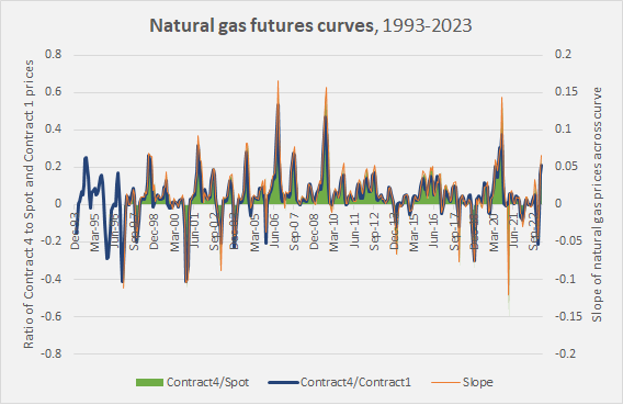
The log ratios are roughly equivalent to percentage values. That is, if the Contract 4/Spot ratio is 0.60, that is roughly equivalent to saying that Contract 4 prices are 60% higher than spot prices. For example, according to the chart above, which goes up to March of this year, Contract 4 was about 20% higher than spot prices.
Generally, from this perspective, it does not appear that it matters precisely how you calculate the curve. You will broadly end with similar results. We can generally use the ratio of Contract 4 to spot prices as our proxy for conditions along the curve, with the caveat that this does not include any longer-dated contracts. This caveat could matter when dealing with UNL, since it holds contracts spread out over a 12-month period.
The following chart places the futures curve alongside the spot and Contract 1 prices.
Chart N. Natural gas prices seem to be inversely correlated with its futures curve. (US EIA)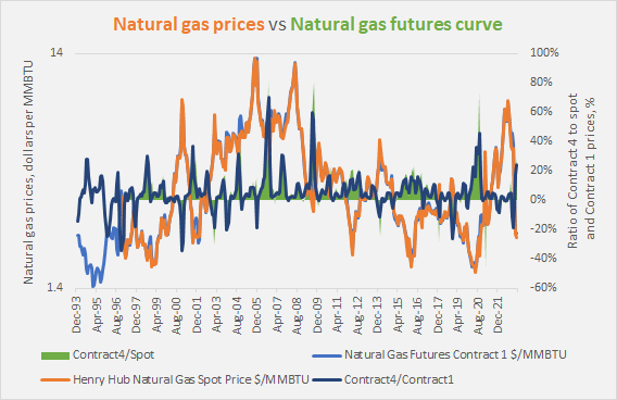
The following chart shows rolling correlations between natural gas prices and the curve.
Chart O. There are only brief periods when spot prices and the futures curve are not negatively correlated. (US EIA)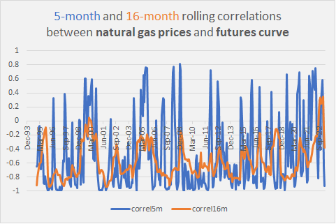
Typically, those correlations are negative, meaning that changes in spot prices tend move the curve. It is difficult to find situations in which prices are low and the futures curve is in backwardation or flat.
Natural gas ETFs and futures curves
UNG primarily invests in the near-month natural gas futures contracts, which means it normally has to roll contracts on a month-to-month basis. In a market which is nearly always in contango, this means that UNG will typically have a higher roll yield than UNL. UNL invests in natural gas futures contracts for the current month and the next 11 months, and each month, it replaces the expired contract with a new one from a year ahead, keeping a constant 12-month spread of contracts. This lowers downside risk over the long term on average. Under certain conditions, particularly when natural gas prices are in free fall and the market is heading into steep contango, it allows you to “beat” spot prices.
Thus, in the following chart which shows natural gas spot prices (in black) alongside the ratio of UNG (in green) and UNL (in orange) to spot prices, you can see that the orange line typically rises as the black line falls, but both UNG and UNL typically severely underperform spot prices.
Chart P. Natural gas ETFs almost always underperform natural gas spot prices, except when spot prices are falling. (StockCharts.com)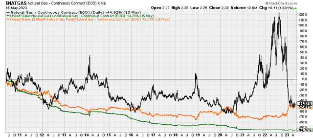
UNG and UNL have been around since 2007 and 2009, respectively, roughly at the tail end of the commodity super cycle, and I was curious if these ETFs might pay off in a super cycle despite their chronic underperformance relative to spot prices, so I approximated the performance of three theoretical funds that started in 1994, illustrated in the chart below.
Chart Q. ETFs would probably have struggled over the course of a commodity super cycle. (US EIA; own calculations)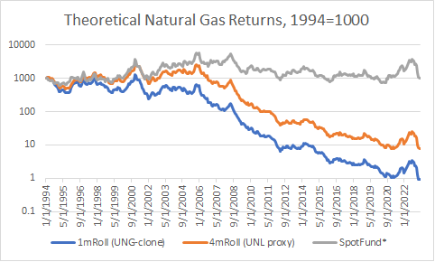
The “SpotFund” assumes that you can invest in natural gas spot prices (for the period up until January 1997, I substituted Contract 1 prices for the missing spot prices). “1mRoll” rolls the near-term contract much in the way UNG does, and “4m Roll” sells the near-term contract each month to buy Contract 4, much in the same way that UNL does, although UNL would likely outperform this proxy, because its contracts are spread out over twelve months rather than four.
The following chart compares the attempt to approximate UNG returns with UNG’s actual performance.
Chart R. Conditions have to be ideal to profit from trading natural gas futures. (StockCharts.com; own calculations)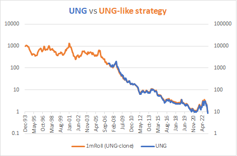
Early on, up until the first spike in natural gas prices in 1999-2000, these theoretical futures funds keep up with spot prices relatively well, but as contango became more pronounced, returns in these funds fell further and further behind.
Chart S. Futures curves steepened during the super cycle of the 2000s and remain higher than they were at the turn of the century. (US EIA)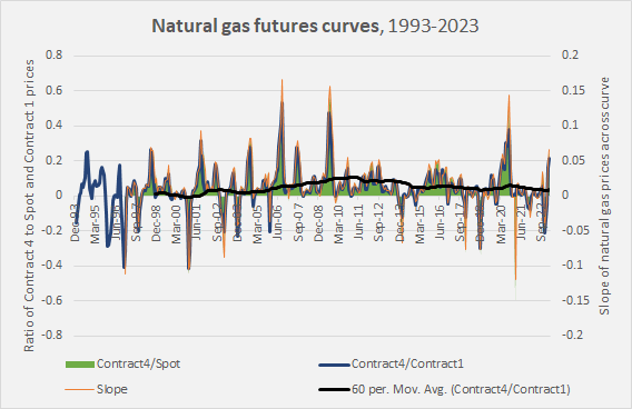
The following chart shows that as contango steepened over the course of the super cycle of the 2000s, relative fund performance plunged.
Chart T. As the futures curve steepened, theoretical futures funds would have increasingly underperformed. (US EIA; own calculations)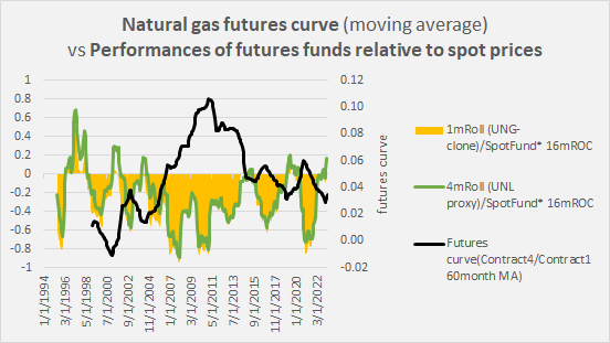
The ultimate point, however, is not to beat spot prices but to simply make money. If you can get 33% of a 6x move and reduce risk, that is what matters.
So, not to belabor the point, there is a pattern that seems to maximize chances of getting a chunk of natural gas upcycles. I will try to illustrate this using the previous cycle that kicked off in 2020.
The 2020-2022 upcycle
The following chart for the years 2018-2022 shows natural gas spot prices in purple, UNG in green, and UNL in orange in the top panel. It shows the UNG/UNL ratio in brown in the second panel, and it shows one measure of spot price momentum in purple at the third panel.
Chart U. Profiting in natural gas ETFs means identifying the spot price’s bottom, as well as the ETFs’ bottoms (and tops). (StockCharts.com)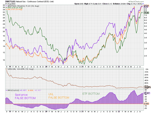
This is a typical but not inevitable setup. Spot prices momentum often experiences a dramatic double dip in a downcycle. Once spot prices do bottom, typically on that second try, they often explode upwards, but because of the steep contango, the ETFs will not typically be well-positioned for it, especially UNG, unless you know precisely where to enter and exit.
In a typical cyclical transition, the best you can hope to do is to catch the middle of the upcycle (in this case, the 21Q1 bottom to, realistically, the 21Q4 pullback when you panicked and sold). During those phases of the upswing (for example, 21Q1-21Q4 or 21Q4-22Q2), UNG outperforms UNL, but it rapidly loses ground during the inevitable pullbacks.
What makes this possible is the combination of rising momentum in the spot price and a flattening of the futures curve, as illustrated in the chart below.
Chart V. The flattening of the futures curve by early 2021 opened the door to ETFs to rally with natural gas prices in the spring. (US EIA)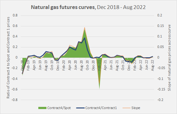
I have not calculated a precise cutoff point for where the “right” curve should be, but it appears that the ratio between Contract 4 and spot prices should be below the 10% level (below 0.1 on the left-hand scale) and below 5% is much better.
The 2012-2014 upcycle
If you look at the 2012-2014 cycle, you can see similar dynamics at work.
Chart W. Despite the substantial shift in natural gas momentum in 2012-2014, ETFs remained generally flat until the late-cycle rally. (StockCharts.com)
Notice that the UNG/UNL ratio in the middle panel appears to be correlated with momentum in the spot price illustrated in the bottom panel. That is largely because the contango was relatively mild over much of this period.
One of the perversities of these relationships is that the best time to buy into these ETFs is near the conclusion of the upcycle, as momentum spikes and the future curves invert.
So, where are conditions now?
Current conditions
First, we can look at the futures curve. The following chart shows spot prices (in black) and October 2023 (AKA Contract 4, in green) to February 24 contracts.
Chart X. Natural gas spot prices have broken well below futures prices. (StockCharts.com)
And the following chart shows the ratios of those contract to spot prices.
Chart Y. Futures spreads remain high, but they are moderating. (StockCharts.com)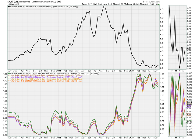
The October 2023 contract is 15% higher than spot prices, which is historically a bit too high to be attractive.
Momentum appears to be bottoming, however.
Chart Z. Natural gas momentum appears to have bottomed. (StockCharts.com)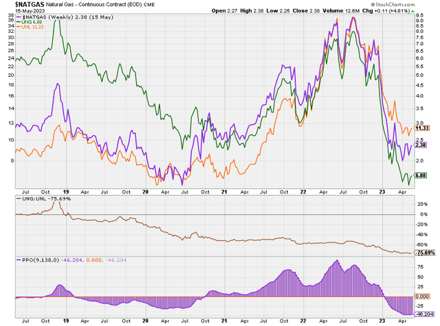
In sum, on the plus side, the nature of the commodity cycle, particularly the combination of high gold prices and low natural gas prices, points to the likelihood that we will see higher natural gas prices in 2024, perhaps substantially higher. And, the apparent bottoming in momentum currently suggests that turn might be soon upon us.
Conclusion
Natural gas’s volatility makes it possible for ETFs like UNG to double in a month’s time, but this seems to be very difficult to time, and because of the nature of these products and the futures market they are based on, timing is everything.
Natural gas prices are likely to be higher by the end of 2024 than they are now, and it is possible that for those keen on making money in the natural gas space, there will be opportunities to use these ETFs to do so, but it will probably be best to wait for more propitious opportunities to do so, particularly when the ratio between Contract 4 and spot prices is below the 10% level, and momentum in spot prices is on the rise.
For those who are nevertheless keen to gain exposure to a potential natural gas upswing in the near term, in light of the state of the futures curve, it would probably be better to buy UNL for now and then wait for the futures curve to flatten. Once it has flattened and momentum turns up again, UNG might provide better upside potential. And, then it will require daily vigilance, as once that upward momentum breaks, the fall can be terribly precipitous.
Timing these factors correctly could potentially yield significant returns, but investors should always be aware of the risks involved and consider their own investment goals and risk tolerance before investing in these volatile ETFs.
Read the full article here